Talking Covers: A Visit With Albert Tang
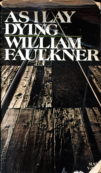
 In college, I had a dirty little secret. When shopping for required poetry and lit, I ignored recommended editions in favor of those with the most pleasing cover art. It didn’t matter if there was a fancy essay, author bio, or notes. Art was everything, a key to the magic within. What was Milton without the blood red skies of the Penguin edition? Faulkner without the dilapidated storefronts and desolate fields of the Vintage series? Cheesy now, these images drew me into the text as no dull academic cover ever could. Maybe I shouldn’t have cared, but slightly ashamed, I did.
In today’s crowded media market where books compete against film, television, and the Internet, cover art matters more than ever. There is a brief window–a few seconds–in which to catch a person’s eye and get them to take a closer look. The back cover, with description and quotes, helps sell the work, but the front is the first impression. It must suggest the story, yet not be too literal; signal the genre, yet stand apart, integrating title and copy into a seamless whole. It has to work–fast.
At Atria Books, this responsibility falls to Albert Tang. When you hear “art director,” Tang is not exactly what comes to mind. Mild-mannered and polite, he could pass in dress for an office worker or high school principal. Then again, so could Wynton Marsalis, which just goes to show you can’t judge a book by its cover.
But we do, so a lot of care goes into their creation. It begins when the publisher, editor, and art director sit down for a cover conference. The editor talks about theme, characters, and plot, and also why he or she loves the book. Conveying this “buzz”–the sense of what makes a book special–is crucial to every step of publishing from acquisition to sales. It is the spark that inspires the team, giving them a sense of mission and higher purpose that sustains through the long, sometimes tedious process. This is where the excitement begins for Tang.
Then he goes back to his office and begins to read, identifying key scenes, picturing what the characters look like, how they dress, the time and place in which they live. “It’s kind of like doing a book report,” he said. Except the stakes are a whole lot higher. For books with huge sales potential, the goal is to appeal to the masses and make the New York Times‘ Best Sellers list. With authors who are new or relatively unknown, the goal is to nudge them into public consciousness. Each book is a labor of love on the part of the writer and entire Atria team. Whatever is said about traditional publishing, there is a lot of passion in it, as well as pride. They take their work seriously.
The first decision Tang makes is whether to design the cover himself or hand it off to one of the talented in-house artists, each of whom has their own specialty. Ultimately, he said, “an AD’s job is finding the right job for the right people.”
Once three or four designs have been generated, Tang puts them up on the wall, steps back, and begins to nitpick and suggest. Refinements are made, then shown to the editor and publisher, and a new round of opinions, suggestions, and sometimes pain, begins. Which is where Tang’s even temperament pays off. Some covers–he oversees about 300 a year–go through multiple and astonishingly varied renditions, and designers need a thick skin. “It’s the only job,” he said, “where you’re rejected 90% of the time.” But the reward is seeing his work and the work of his team on display in Barnes & Noble and Amazon.com (where, of course, the cover has to work in a smaller size).
Once designs are finalized, jpegs are sent to the author. “It’s their baby,” said Tang, “and I’m telling them what it’s wearing.” The threads are usually well-received. Matt Gallagher loved the cover of his novel Young Blood so much he couldn’t put it down. It was the finishing touch of a dream; the signal his work was ready to go out into the wide world.
After author approval, there is a meeting with the in-house sales rep who knows what sells and, of course, offers input. As do buyers for major chains like Barnes & Noble.
For all the steps and opinions involved, it’s the golden age of book covers, with tools like Adobe Photoshop and Illustrator, instant access to artists and photographers via the web, and readers who have grown ever more sophisticated in their visual taste. Literalness is out, evocative is in, leaving more room for the designer. Though he listens carefully to the editor and publisher, Tang admits, “I don’t want to give them exactly what they want.” He aims to go beyond, adding a special visual poetry of his own.
For The Railwayman’s Wife, a novel by Ashley Hay set in Thirroul, Australia in 1948, the cover art began with an evocative, black-and-white image discovered in a photo archive.
Next, the image was sent out to have color added.
Additional elements were considered–railroad tracks and a female figure (the tracks stayed, the figure went). Matte paper stock was chosen to suggest fine art and signal the genre of literary fiction.
Another project, another day in a life that took an unexpected turn. Tang comes from a traditional Chinese family that wanted him to enter a traditional profession, not art and design, which they didn’t understand. He enrolled at St. John’s, hoping to become an illustrator, but an internship at Penguin Books during his junior year changed his mind. He switched to graphic design, and after graduation, worked at Penguin for three years and Norton for ten, before arriving at Atria Books.
About which a word must be said. Atria, an imprint of Simon & Schuster led by Judith Curr, is an incredibly imaginative place that is rethinking where books come from and what they are. In 2015, they launched the Crave mobile app which integrates short chapters of romance novels with texts from characters and clips of hot guys (“book boyfriends”) into an immersive experience. They have published young Internet sensations like Marzia “CutiePieMarzia” Bisognin and Connor Franta, betting there would be an audience for their books. There was. Ideas flow freely between different media, and thinking is outside the box. There is no box–unless it’s the one sent to you by your “book boyfriend,” another imaginative Atria promotion.
Looking through my notes, I realize that Albert Tang didn’t talk very much about himself. It was all about process, consensus, and team. But his passion is there, his talent and contribution huge. The cover of a book is a reader’s first impression and lasting memory, an icon that brings them to new voices and wonderfully imagined worlds.
Just another day at work for Albert Tang.
– Catherine Kirkpatrick


